What Is the 70-30 Rule in Interior Design?
 October 6, 2026
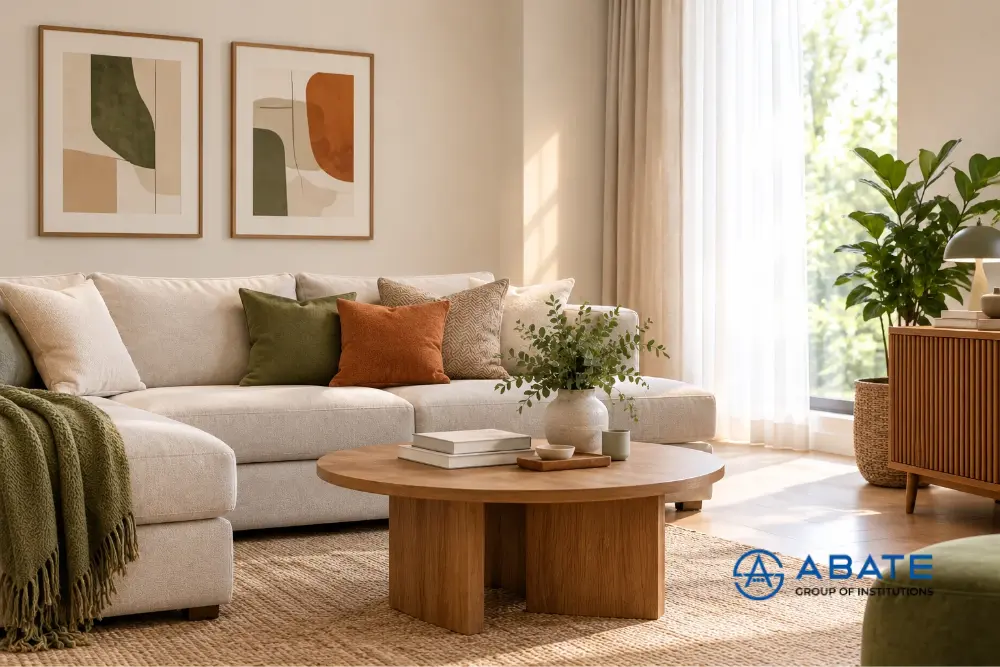
Creating a well-designed interior is not always about choosing expensive furniture or following the latest trends. Often, the key is understanding how different colours, materials, patterns, and design elements work together. One simple principle that can help designers create a balanced space is the 70-30 rule in interior design.
The 70-30 rule generally refers to using one dominant design element for around 70% of a space, while a complementary element occupies the remaining 30%. It is commonly used when planning colour schemes, materials, textures, styles, or visual elements. This rule gives designers a simple starting point for creating interiors that feel coordinated without becoming repetitive.
What Does the 70-30 Rule Mean in Interior Design?
The 70-30 rule means that approximately 70% of the room follows a dominant theme, colour, material, or style, while the remaining 30% introduces a contrasting or complementary element.
For example, imagine a living room where:
- 70% of the visual design uses neutral colours such as white, beige, or grey.
- 30% uses a stronger colour such as blue, green, or terracotta.
The dominant 70% creates consistency, while the remaining 30% adds character and visual interest. It is important to remember that the 70-30 rule is not a strict mathematical formula. Interior designers can adjust the proportions depending on the size of the room, design style, furniture, lighting, and personal preferences.
Why Is the 70-30 Rule Important?
A room where every element has equal visual importance can sometimes feel confusing or overwhelming. On the other hand, using only one colour, texture, or style can make a space feel flat. The 70-30 approach creates a visual hierarchy.
The dominant 70% provides:
- Consistency
- Visual stability
- A clear design direction
- A sense of harmony
The 30% provides:
- Contrast
- Personality
- Visual interest
- Opportunities to introduce accent colours or materials
By working together, they can create harmony and meaning within a room.
How to Use the 70-30 Rule with Colours
One of the easiest ways to apply the rule is through colour selection. Suppose you are designing a bedroom. You could use a soft neutral shade across most of the room, including walls, flooring, and larger furniture. This can represent the 70%.
The remaining 30% can come from:
- Curtains
- Cushions
- Artwork
- Rugs
- Bed linen
- Decorative accessories
- Accent furniture
For example, a beige bedroom could include dark green cushions, curtains, artwork, and a chair to introduce contrast. The exact percentage does not need to be measured. The idea is to make sure that the accent colour does not overpower the main colour.
Using the 70-30 Rule with Materials
The principle can also be applied to materials. For example, a contemporary living room might use wood as the dominant material and introduce stone, metal, or glass as the secondary material.
A possible combination could be:
70%: Wood finishes and neutral upholstery
30%: Stone surfaces, metal details, and glass elements
This provides variety but maintains cohesion throughout.
Materials can also be balanced through flooring, wall finishes, furniture, countertops, ceiling treatments, and decorative elements.
Using the Rule with Patterns
Patterns can quickly become overwhelming when too many are used together. The 70-30 principle can help control this. For example, a bedroom may have mostly plain fabrics and surfaces, while patterned cushions, curtains, or wallpaper provide the remaining visual interest.
You could use:
70%: Plain or minimally patterned surfaces
30%: Geometric, floral, striped, or textured patterns
This allows patterns to become accents instead of dominating the entire room.
70-30 Rule for Mixing Interior Styles
The principle can also be useful when combining different interior styles. For example, someone may want a modern home with traditional elements. Instead of dividing the room equally between both styles, one style can remain dominant.
A designer could use:
70% Modern: Clean furniture, simple colours, contemporary lighting, and minimal decoration.
30% Traditional: Wooden details, classic artwork, traditional furniture, or decorative accessories. This approach can help create an interior that feels connected rather than visually divided.
How to Apply the 70-30 Rule in Different Rooms
Living Room
Use a neutral colour or material for most of the room and introduce a stronger accent through cushions, rugs, artwork, curtains, or occasional furniture.
Bedroom
Keep larger elements such as walls, wardrobes, and beds relatively simple. Use the 30% portion for bedding, artwork, lighting, and decorative accessories.
Kitchen
Cabinet finishes can represent the dominant element, while countertops, backsplashes, hardware, or lighting introduce contrast.
Dining Room
A dominant colour palette can be complemented with contrasting chairs, artwork, a rug, or a statement light fixture.
Office
Neutral walls and furniture can form the dominant 70%, while plants, artwork, accent seating, or coloured accessories create the remaining 30%.
Is the 70-30 Rule the Same as the 60-30-10 Rule?
No. These are related design principles, but they are not exactly the same.
The 60-30-10 rule is commonly used specifically for colour distribution:
- 60% – dominant colour
- 30% – secondary colour
- 10% – accent colour
The 70-30 rule is broader and can be used as a general way to balance dominant and secondary elements, including colours, materials, patterns, and styles. Designers do not have to follow either rule rigidly. They can use these proportions as guidelines and adjust them according to the requirements of a project.
Common Mistakes When Using the 70-30 Rule
1. Treating the percentages Too Literally
One should keep in mind that less importance should be given to the multiplication of every element up to 70% and 30% as part of interior design.
2. Choosing a Weak Contrast
If the secondary element is too similar to the dominant element, the room may lack visual interest.
3. Using Too Many Accent Elements
The goal of the 30% is to support the main design concept. Adding too many different colours, patterns, and materials can make the room look cluttered.
4. Ignoring Lighting
Colours and materials can look very different under natural and artificial lighting. It is essential to pay attention to how the chosen elements fit throughout the course of the day.
5. Forgetting Functionality
A beautiful colour combination or material selection still needs to work for the people using the space. Practicality should remain an important part of interior design decisions.
Tips for Interior Design Students
Understanding design principles such as the 70-30 rule can help students develop a stronger sense of balance and composition. However, applying these ideas in real projects is equally important.
Students can practise by:
- Creating different colour combinations
- Experimenting with contrasting materials
- Designing mood boards
- Studying existing interiors
- Creating room layouts
- Working with design software
- Visiting completed projects and construction sites
- Experimenting with different design styles
These activities can help students understand how theoretical design principles translate into actual spaces.
Learning Interior Design Beyond Theory
Interior design involves much more than selecting colours and furniture. Students need to understand space planning, materials, lighting, furniture, design software, presentations, practical projects, and how design decisions work in real environments.
At Abate Group of Institutions, students pursuing an interior design course in Calicut, Kannur, Malappuram can learn through an industry-focused approach that includes Ai-integrated education, industry software training, practical projects, international exposure, and placement assistance. Understanding principles such as the 70-30 rule and then applying them through practical design exercises can help students gradually develop their own design approach.
Conclusion
The 70-30 rule in interior design is a simple guideline for creating balance between a dominant element and a complementary one. It can be applied to colours, materials, patterns, textures, and even different interior styles.
The most important thing is not to follow the percentages rigidly. Instead, use the principle to understand visual hierarchy, balance, and contrast. With practice, designers can learn when to follow the rule and when to adjust it based on the requirements of a particular space.
FAQs
What is the 70-30 rule in interior design?
The 70-30 rule is a design guideline where approximately 70% of a space follows a dominant colour, material, pattern, or style, while the remaining 30% provides contrast or visual interest.
Is the 70-30 rule only used for colours?
No. It can also be used for materials, patterns, textures, furniture styles, and combinations of different interior design styles.
Is the 70-30 rule mandatory?
No. It is a guideline rather than a strict formula. Designers can adjust the proportions depending on the project and desired visual effect.
What is the difference between the 70-30 and 60-30-10 rules?
The 60-30-10 rule is mainly used for colour distribution, while the 70-30 rule can be applied more broadly to balance dominant and secondary design elements.
Can beginners use the 70-30 rule?
Yes. It can be a useful starting point for beginners who are learning how to create balanced colour schemes, material combinations, and interior styles.